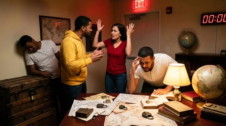
A light flickers at the end of a narrow corridor. The wallpaper peels like old skin, colors drained to a sour gray. Somewhere in the dark, a slow, wet sound. You cannot see the source. Your body feels it first: shoulders tighten, breath shortens, thoughts scatter. You are not just looking at a set. You are inside an emotion.
Fear.
This is the material horror designers work with.
The short answer: designing effective horror experiences is less about gore and props and more about exploiting how the human brain handles threat, uncertainty, and control. You build fear by shaping anticipation, withholding information, attacking the senses in careful waves, and playing with a guest’s sense of agency and safety. Think of it as choreographing stress and relief in space and time. The walls, the lighting, the sound design, even the smell in the air all become instruments that press on instinct, memory, and imagination.
Good horror design does not ask “What monster should I show?” but “What part of the guest’s mind should I make question itself?”
The brain you are designing for: fear as a survival system
Before we talk about fog machines and creaking floorboards, you need a mental model of the system you are provoking.
At its core, fear is a survival response. There is a fast, blunt path and a slower, thinking path.
| Path | What it does | Design relevance |
|---|---|---|
| Fast path (amygdala) | Instant alarm: heart races, muscles tense, startle reflex | Jump scares, sudden loud sounds, flashes of light, looming shapes |
| Slow path (cortex) | Interprets: “What is that? Am I really in danger?” | Story, clues, ambiguity, moral discomfort, dread |
You are designing for both. If you only hit the fast path, you get cheap startles that guests laugh off. If you only use the slow path, they may admire your concept but never feel it in their bodies.
Fear design lives in the friction between “I am safe; this is just a show” and “My body disagrees.”
A few psychological levers matter more than any prop catalog:
1. Uncertainty: the engine of dread
The brain hates not knowing. Uncertainty about when, where, or what kind of threat might appear raises baseline arousal. Guests become hyper-vigilant. Every shadow becomes a candidate.
Uncertainty comes in many forms:
– Visual: obscured sightlines, partial views of objects, flickering light
– Temporal: irregular timing between scares, long stretches of “nothing”
– Narrative: unclear rules about what can hurt you in this world
If guests can predict, they will armor up emotionally. They count beats. They scan corners. Your job is to constantly betray their patterns, but in a way that feels coherent with the world.
2. Loss of control and agency
A person who feels in control is hard to scare. A person who feels trapped is easy to scare, but ethically tricky. Horror design sits between these poles.
The fear system spikes when:
– Movement is restricted or directed by the environment
– Choices feel meaningful but have uncertain outcomes
– Social norms stop working (you call for help, no one responds)
This is where immersive theater and haunt design diverge from film. You control where a camera points. You do not control where a guest looks. What you can do is shape the flow of options so that the “safe” path never feels fully safe.
Good horror never simply removes control; it lets guests reach for control and feel it slipping through their fingers.
3. Threat to the body vs threat to the mind
There are two broad kinds of fear:
– Physical threat: harm, injury, pursuit, sharp objects, diseased bodies
– Psychological threat: betrayal, contamination, loss of identity, moral collapse
Most haunted attractions lean too hard on physical threat: knives, blood, people shouting. It works, but it flattens quickly. Psychological threat lingers. A corridor where everyone speaks in your voice. A room that reacts to your breathing. A choice that forces you to “harm” one character to save another.
You want both. The physical primes the body. The psychological stains the memory.
From psychology to space: how fear flows through an environment
Now we move from theory to architecture. You are not just making rooms. You are sculpting an emotional curve.
Think about the experience as a piece of music. Not a constant roar, but verses and choruses, quiet breaks and sharp crescendos. The timing of fear is as critical as the content.
Monotone terror becomes noise. Contrast makes fear legible.
Here is a simple way to think about structuring a horror journey:
- Invitation / consent: Guests cross a threshold knowingly.
- Orientation: The world teaches its rules.
- Unease: Something is wrong, but no direct threat yet.
- Confrontation: Threats break cover; fear spikes.
- Disorientation: Rules bend or break.
- Climax: The most intense convergence of threat and emotion.
- Release: Safe re-entry to normal space.
Let us break these into design questions.
Inviting fear: threshold and contract
Fear only works if guests accept the basic contract: “I will feel threatened, but I am actually safe.”
Your threshold is not just a door. It is a psychological gate. Ticketing, a warning sign, a ritual of entry, a character who greets them and explains “the rules” in-world. All of these set expectations and calibrate consent.
If you plan to use intense tactics (isolation, invasive touch, strong themes), the threshold must be honest. Hiding it is not clever; it is disrespectful.
Teaching the world: early rooms and signaling
The first spaces should be emotionally readable. Think of them as a warm-up, even if they are visually cold.
You can teach:
– What counts as a threat: Are actors allowed to get close? Can objects move by themselves?
– What the physics feel like: Will the ground shift? Will light fail completely?
– What the story questions are: Who was here before? What went wrong?
This teaching can be visual, spatial, or interactive. A polaroid wall that hints at missing visitors. A corridor with light that cuts out exactly as a guest passes, then returns. The brain catalogues these moments as “possible.”
If you teach no rules at all, guests default to film logic and miss half your work.
Building unease: layering signals of threat
Unease is low-grade fear, spread over time. It builds dread.
Architecturally, this is where you stretch corridors slightly too long, lower ceilings so that tall guests feel pressed downward, turn doorways slightly off-axis so nothing is comfortably straight.
Sound plays a major role here. Not loud stings. Background cues:
– Slightly detuned music that seems to slow and speed unpredictably
– Sub-bass rumbles that most guests feel more than hear
– Localized, unexplained sounds: scraping behind a wall, a quiet cough in an empty room
Scent is frequently neglected, and that is a mistake. The olfactory system is tied to memory and emotion. The sharpness of disinfectant, the sweetness of rotting fruit, the metallic hint of rust: each can push the body toward suspicion before the mind catches up.
Striking: startles, chases, and breaks in pattern
A good scare is a violation of an expectation you helped create.
If a corridor has had nothing but audio illusions, the first physical intrusion hits three times as hard. If actors have moved slowly and silently, the first sprint feels explosive.
Jump scares work, but they should be timed and justified:
– Visual: something appears where there was nothing
– Auditory: a sudden loud sound, but with a source, not a random crash
– Environmental: floor buckles, wall panels shift, air blasts
The aim is not constant shrieking. It is a spike that recharges the body’s fear chemistry, so the next quiet moment is more charged, not less.
Disorienting and bending rules
Once guests think they know the rules, you can break them.
A corridor that loops on itself without feeling like a loop. A character you saw dead, now alive, insisting nothing happened. Props that subtly change position between passes.
Spatial tricks:
– Mirrors to imply space that is not real
– Forced perspective to make distances feel wrong
– Tilted floors that suggest drunkenness or inner imbalance
Cognitive tricks:
– Light flicker timed to make movement appear stuttered
– Ambient voices that repeat guests’ own words a few rooms later
– Written text that seems to alter when revisited
Disorientation should never be so strong that guests lose basic physical safety. They should question reality, not their ability to stand upright without injury.
Climax and release: letting the body come down
You cannot hold peak fear indefinitely. The nervous system fatigues. The final section should compress the strongest elements you introduced.
This might be:
– The most physically constricted corridor
– The brightest display of what was hinted at before
– A choice with the clearest moral weight
Your last scare is not just the biggest; it is the most thematically clear. It answers the question “What was I afraid of, exactly?” even if that answer is unsettling.
Then: a real release. Light opens. Ceiling height rises. Sound softens. A clear path out. Your guests need a chance to metabolize what they felt, or their memory of the experience will blur to static.
Tools of fear: light, sound, texture, and proximity
Highly technical tools become expressive when you tie them to psychology. Light is not just “low.” Sound is not just “creepy.” Each element should have a job.
Light: controlling what exists and what does not
Fear lives at the edge of vision. Instead of simply “making it dark,” think in gradients.
| Lighting choice | Psychological effect | Usage in horror design |
|---|---|---|
| Low, even light | Calm, clarity | Safe hubs, prelude rooms |
| High contrast, sharp shadows | Ambiguity, suspicion | Transition spaces, areas with hidden actors |
| Flicker or strobe | Unreliable perception, fragmented time | Short bursts near climaxes, to distort movement |
| Backlighting / silhouette | Threat without detail | Early hints of creatures or characters |
| Color shifts | Emotional cueing (red for urgency, green for sickness) | Marking phases of the journey |
What you do not light is part of the set. Darkness is not absence; it is material.
A common misstep is constant under-lighting. If every space is oppressive, the eye stops searching and guests adopt a resigned posture. Give them occasional visual generosity. Detail-rich rooms where they can really see glyphs, objects, textures. Their curiosity rises. Then you take that clarity away when they want it most.
Sound: the spine of the experience
Close your eyes and imagine your horror project. If the sound design is an afterthought, the fear will feel thin.
Three layers matter:
1. Bed: constant tone or texture that defines the world
2. Mid events: irregular sounds that suggest offstage life
3. Foreground hits: tightly timed cues aligned to guest actions
The bed might be a low, throbbing hum, distant wind, or industrial drones. It sets the emotional climate.
Mid events keep the space from feeling dead. They should have implied sources: distant doors, muffled speech, animal noises. Sometimes you reveal these sources later. Sometimes they remain unanswered questions.
Foreground hits are your whips and knives. A sharp violin scrape when a door slams. A reversed vocal sample that triggers when someone steps on a certain board. The cue must feel tied to something visible, or the brain bookmarks it as “artificial.”
Spatial audio is a powerful psychological lever. A whisper that seems to circle your head, footsteps behind you that are not there. These cues gently uncouple visual and auditory perception, raising unease without a single prop.
Texture, temperature, and the body
Fear lives in the skin.
Surfaces that guests touch or brush past should be chosen with intent. Rough concrete that scrapes knuckles a bit. Slick, almost organic plastic sheets that cling as you push through. Dust on a banister that leaves a faint mark on the hand.
Temperature shifts also matter. A drop of a few degrees can trigger a primal sense of exposure. A slight rise in a cramped, crowded hallway intensifies the feeling of being trapped with others.
Humidity, too. Dry air feels clinical. Damp air feels like rot, or breath.
If guests only see fear, they are watching a show. If they feel it on their skin, they are inside it.
Proximity: how close is too close?
The space between guest and threat is one of your strongest sliders.
There are multiple distances at play:
– Distant: figures seen across a large set; safe to observe
– Personal: an actor at arm’s length, making eye contact
– Intrusive: someone at the shoulder, speaking low, or an object brushing the face
Ethically, you must define a boundary for physical contact and stick to it. Many horror experiences abuse proximity, using aggressive touch or cornering to provoke panic. It works, but it narrows your audience and risks real harm.
Thoughtful proximity design uses:
– Vertical distance: sounds from above, figures on mezzanines looking down
– Lateral surprise: threats arriving from the periphery rather than straight ahead
– Psychological closeness: a character that knows a guest’s name or secret (even if engineered)
If you want intense fear without physical overstepping, focus on personal space invasion by objects: doors that close just behind heels, fabric that strokes shoulders, air jets that suggest insects or passing movement.
Different flavors of fear: choosing your emotional palette
Not all horror feels the same. Before you sketch your set, decide what kind of fear you want to live in the walls.
“Scary” is not a genre. It is a spectrum of emotional colors. You do not need all of them.
Here are a few common types, with design cues.
Dread: fear of what has not happened yet
Dread is slow. It relies on anticipation, not impact.
Design moves:
– Long sightlines with unclear endpoints
– Clocks, timers, or repeated phrases that suggest a coming event
– Objects that point in one direction, as if something passes that way often
Sound tends to be sparse, with emphasis on distant, repeating motifs. Light is usually static, not manic. You want guests to have time to think “Something is coming,” and then think that again, and again, until their bodies tighten.
Shock and startle: the body’s reflex
This is the pure jump scare. Useful, if not overused.
Key points:
– You must earn the silence before the impact
– The scare should have a clear source
– The withdrawal is as important as the arrival
Design for exit. Where does the threat go? Where does the guest go? A jump scare with no path forward becomes awkward, not frightening.
Disgust and contamination
Fear of the unclean, the invasive, the corrupting. This kind of horror often uses body imagery, decay, parasites.
Design through:
– Textures that feel “wrong” to touch
– Visual motifs of spreading stains, molds, or fluids
– Sound of squelching, chewing, flies
Ethically, be mindful of triggering real phobias (maggots, disease) without warning. Contamination horror can veer into ableist or stigmatizing imagery if you lazily equate “illness” with “monster.”
Existential and psychological fear
This is less about “I might die” and more about “I might not be who I think I am” or “The world does not work.”
Examples:
– Time loops where choices seem to have no effect
– Doppelgangers
– Spaces that erase or rewrite guests’ actions
Set design might involve repeating rooms with subtle changes, or objects that rearrange themselves between visits. Narrative might question memory or identity.
This flavor can be deeply affecting even without a single raised voice.
Immersive horror: when guests are part of the story
Traditional haunts funnel guests through like a ride. Immersive horror asks them to participate, to converse, to choose. This shifts the psychological ground.
Interactivity amplifies fear in two ways:
1. It raises self-consciousness: guests feel seen, judged, responsible.
2. It personalizes consequences: choices feel like they matter.
The scariest line an actor can say is not “I will kill you,” but “This is your fault.”
Agency that stings, not overwhelms
Too little agency, and guests feel like props. Too much, and they freeze.
Good interactive horror gives:
– Clear, simple branches: go with this character, or that one
– Actions that feel small but ripple: signing a document, pressing a button
– Feedback that reflects those choices later: a room rearranged, a character’s changed tone
The trick is to make the consequences emotionally heavy without needing a fully branching narrative tree. Symbolic callbacks work: a piece of costume you touched appears later, bloodstained. A phrase you used is quoted back in accusation.
Characters as instruments of fear
Actors are not just delivery mechanisms for jump scares. They are living interfaces between set and psychology.
Strong horror performances often pivot between:
– Comfort and threat: a helper who turns, a childlike figure who reveals cruelty
– Distance and intimacy: a preacher addressing the room, then stepping close to one guest
– Sanity and break: someone calm who slowly unravels in front of guests
From a design perspective, build stages for these shifts. A confessional booth, a pulpit, a nurse’s station. Places where power dynamics are visible and can flip.
Safety must be clear backstage. Actors need reliable escape routes and safe words, guests need clear signals for boundaries. Horror that risks real-world harm is not edgy; it is poorly designed.
Ethics of fear: responsibility inside the illusion
If you work with fear, you work with vulnerability. Some designers treat that as a license. It should be a responsibility.
Key questions to hold during design:
– What groups could this experience unintentionally target or mock?
– Where might a trauma response be likely, not just startle?
– What are our options for guests to pause or exit?
Content that draws on real-world oppression, self-harm, or specific historical atrocities requires deep care, if used at all. Horror can explore these themes thoughtfully, but not by reducing them to “spooky seasoning.”
You are not just scaring “an audience.” You are affecting individual nervous systems that keep living after they leave your set.
Practically, design:
– Clear content advisories at entry
– Visible, reachable staff in neutral costume who can help if needed
– Exit paths that feel in-world but lead safely out
Work with your performers on de-escalation. They should know how to read a guest who is dissociating, not just screaming. Teach them that not every silence is “good fear.”
Concept to concrete: weaving psychology into design decisions
Let us walk through a brief example: you are designing a horror experience about a failed experimental sleep clinic.
Your core psychological levers:
– Uncertainty: guests cannot tell if they are awake or dreaming
– Loss of control: treatments that “adjust” perception
– Existential fear: erosion of memory and identity
Translate that into space.
Entrance and orientation
Guests enter a sterile lobby. Bright light, clinical charts. Staff in white coats, polite. Fear is low, but hinted: sleep diaries with pages scratched out, a signboard listing “Side effects: memory gaps, prolonged paralysis.”
You teach:
– Staff can speak to you directly
– Doors labeled in a calm, bureaucratic way
– The core question: “How long have you been awake?”
Unease in the corridors
The first corridor is slightly too quiet. A soft beeping of monitors behind walls, faint breathing amplified through vents.
Lighting is cool, overhead, but every third fixture flickers in a slow, arrhythmic pattern. As guests pass certain doors, they hear their own footsteps duplicated a half-second out of sync.
Texture: smooth floor, but occasional sticky patches, as if something spilled long ago and was poorly cleaned.
First breaks in reality
A dormitory room: beds with straps, sleep masks, EEG caps. A “patient” sits up, calm, and tells guests they are dreaming. That they have done this before. That this is the only part they do not forget.
When guests return to the corridor, it is subtly different. Room numbers changed. A clock that was ahead now reads behind. The body starts to doubt.
Sound now includes a soft whisper in the air vents: fragments of guests’ previous lines (pre-recorded from earlier groups, or generative). They feel followed by their own history.
Climax: paralysis and helplessness
The climax room might simulate sleep paralysis. Guests lie on gurneys or sit in fixed chairs, with voluntary restraint for those who consent.
Lights dim to near black. A low-frequency tone rises. Shapes move in the corners of vision. A figure stands at the foot of the bed, then inches closer in minuscule steps between light flickers.
Instead of shouting, the figure speaks almost conversationally about how the body is certain, and the mind is wrong, and how this has always been happening.
Physical safety is absolute. Guests can signal to be released at any time. But the design squeezes the sense of agency at the psychological level.
Release and residue
On exit, the lobby looks the same. Staff is polite. But the wall clock reads a very different time than when they came in. One poster is new. A Polaroid of their group appears on the board, already slightly yellowed.
You offer a space for decompression, perhaps with behind-the-scenes material or a quiet bar. The experience leaks a question into life outside: “How much of what I remember is reliable?”
This is horror that respects the guest while still using psychological tools to twist their perception.
A designer’s stance: respect the fear, respect the guest
Fear is a crude material that can be shaped with great subtlety. You can aim it at cheap targets, or you can build richer, stranger experiences that linger without wounding.
If you want your horror work to mature:
Chase not higher volume of screams, but deeper shades of silence when the house lights rise.
Study clinical psychology as carefully as you study prop catalogs. Talk with your performers about their emotional safety as much as their blocking. Listen to audiences who say “This went too far” without becoming defensive.
Horror design, at its best, treats fear like clay and the guest like a collaborator. The set, the light, the sound, and the touch of the walls are all invitations to step closer to an edge, look down, and then step back with a slightly altered sense of self.
That is the quiet power hiding under every plastic skeleton and bucket of stage blood: the chance to design not only what people see in the dark, but what their own minds do with it.