The curtain parts on smoke and silence. A broken chandelier glints in the ghost light. Torn flyers from a long-closed show curl at the edges of a lobby wall, colors drained by time. Somewhere in the dark, an automated lighting cue still runs every night to an empty stage, hitting its marks for an audience that will never return.
This is where Broadway failures live. Not in spreadsheets or box-office recaps, but in the haunted afterglow of sets, costumes, and half-remembered songs that stubbornly refuse to die.
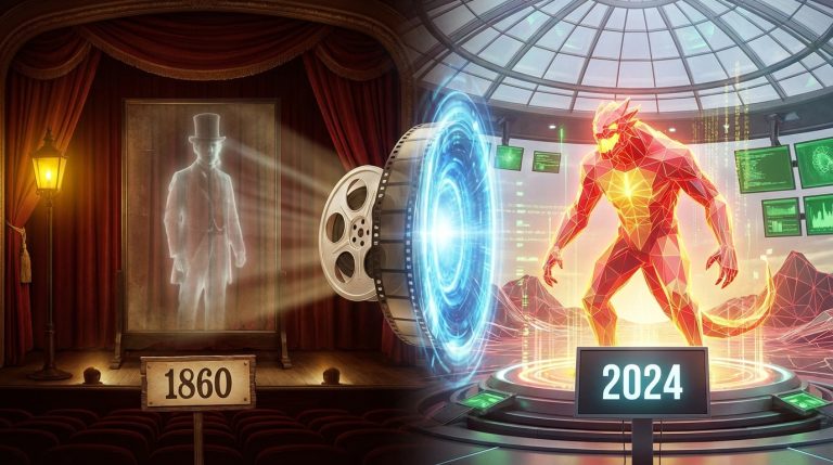
The short version: some Broadway shows collapse so hard they punch a hole clean through their own disaster and come out the other side as legends. They are expensive, messy, sometimes embarrassing, and absolutely fascinating. “Carrie,” “Spider-Man: Turn Off the Dark,” “Merrily We Roll Along,” “Moose Murders,” and other infamous titles did not work in the moment, but they changed how artists think about risk, spectacle, and storytelling onstage. They are the theater world’s beautiful wreckage: failures that designers, directors, and writers keep studying, quoting, and stealing from, long after the accountants have stopped wincing.
These flops are not just cautionary tales. They are design laboratories where ambition burned too hot. They show what happens when technology roars louder than story, when concept crushes human scale, or when commercial pressure smothers fragile experimentation. They also prove that audiences are far more sensitive to sincerity, tone, and craft than any marketing campaign will admit.
The strange glamour of failure on a Broadway stage
Failure on Broadway is rarely quiet. It is lit, miked, and painted eight times a week until someone finally reaches for the stop button. That scale of collapse leaves behind extraordinary detail for artists to study.
A Broadway flop is still a fully built world: designed, rehearsed, lit, and costumed. It just did not convince enough people to keep visiting.
In set design and immersive work, these shows are like giant, expensive sketches. You can see the raw intention peeking through the cracks where the structure gave way. You might hate the show and still fall in love with a single lighting transition, a costume silhouette, or a piece of scenery that tried to do something no one had dared before.
This is why so many theater people talk about legendary failures with an almost guilty affection. They remember how it felt to sit in those seats while something unraveled in real time. A flying rig that did not quite clear its path. A rotating set that fought against the actors instead of supporting them. Choreography that looked like it belonged to a different narrative universe than the music. The thrill of watching a system strain against its own limits.
“Carrie”: blood, basketballs, and a myth born from chaos
There is a certain color of stage light, a sour magenta-pink, that will always feel like “Carrie” to anyone who has studied that production. The show opened on Broadway in 1988 and closed three days later. Yet it refuses to die. Cast recordings circulate. Bootleg photos are shared like contraband relics. Designers still trade stories about its infamous gymnasium-and-prom world.
“Carrie” is what happens when theatrical courage meets tonal confusion: everything onstage is loud, committed, and sincerely wrong for the material.
Imagine trying to design Stephen King’s horror, but as a pop-rock musical, set in high school, wrapped in 80s aesthetics. The result was half haunted cathedral, half aerobics class. Stark white units glowed under saturated colors, while dancers in headbands kicked basketballs in choreography that felt lifted from a workout video.
The set tried to be abstract and literal at the same time. A raked white platform. Stairs. Architectural shapes that could read as both school and church. On paper, it could have been powerful: a blank, oppressive space that turned bloody at the end. In practice, the vocabulary of the environment shifted too quickly between “camp” and “terror.” The audience did not know how to feel, and the actors seemed trapped between styles.
| Element | What was attempted | Why artists still study it |
|---|---|---|
| Set | Abstract white world that could become gym, home, and church through light and movement. | Teaches how flexible environments can misfire if the emotional rules of the space are not clear. |
| Lighting | High-contrast, saturated color to separate “normal” life from Carrie’s inner storm. | Shows the risk of over-signaling emotion with color; when everything screams, nothing lands. |
| Choreography | Big, athletic moves, basketballs, stylized teen culture. | Reveals how movement tone can sabotage narrative tension if it belongs to a different emotional genre. |
The famous blood moment, central to the horror of the story, had to compete with a visual environment that already shouted at the audience. When everything is maximal, the most shocking turn cannot escalate. For immersive and set designers, “Carrie” is a reminder that restraint is not the enemy of spectacle, but its foundation.
You can fill a stage with color and movement, but if the emotional temperature of the design does not match the story, the audience floats above it instead of falling in.
The irony is sharp: “Carrie” failed commercially, but its afterlife proved that daring, even misguided, can age into influence. The later Off-Broadway reworking pulled the design language inward, softening edges and grounding the school world in more believable textures. The cult that formed around the original spoke loudly enough that the creative team could return, listen, refine, and rescue something tender from the wreckage.
“Spider-Man: Turn Off the Dark”: when machinery becomes the main character
“Spider-Man: Turn Off the Dark” felt like a stage show possessed by its own rigging. You remember the headlines: staggering budgets, injuries, delays, rewrites. Yet if you strip away the noise and look at it as a design object, it becomes a case study in one fundamental truth:
If the tech is the story, the story is already lost.
The ambition was wild: to turn the proscenium into a comic book frame that could fracture open, fly into the audience, and wrap the entire house in webs of video, light, and aerial stunts. The initial vision stretched beyond a set, into something close to a live graphic novel.
There were moments of real visual poetry. A villain sketched onto a panel and then stepping out into depth. Web lines slicing across the orchestra, pulling focus into the air. New York skyscrapers tilting and stacking in improbable ways that looked right out of a drawn page.
The problem sat at the core: the emotional arc of Peter Parker drowned under the spectacle that was supposed to serve him. Every aerial stunt had to work against gravity, safety protocols, mechanical failure, and fear. The show kept asking the audience to marvel at the system itself, not at the boy inside the suit.
For set and immersive designers, “Spider-Man” is rich with hard lessons:
- When your main scenic vocabulary requires complex mechanics, the narrative must be simple, clear, and emotionally generous. The brain cannot track intricate machinery and subtle storytelling at the same time.
- If your most iconic effect can fail publicly, you must design a poetic “Plan B” that feels intentional, not like an apology.
The stage had become an engineering site. Every scene change was a negotiation with physics. Over time, the structure of the show shifted to accommodate what the building could reliably do, not what the characters needed. That inversion is deadly. The room begins to feel like a demonstration rather than a story.
In immersive theater, designers sometimes chase a “wow” technology: motion tracking, projection mapping, hydraulic floors. “Spider-Man” stands in the background like a warning lamp. It asks one hard question: if the gadget failed entirely, would what remains still move you?
Spectacle is strongest when it feels like a natural extension of a character’s inner world, not a separate organism that needs to justify its presence.
“Merrily We Roll Along”: a quiet flop that grew into a classic
Not every Broadway failure looks like a catastrophe at the time. Some feel like a slightly awkward opening night that just does not gather momentum. “Merrily We Roll Along,” with music and lyrics by Stephen Sondheim, opened in 1981 and closed after 16 performances. No flying rigs crashed. No one was injured. The disaster here was softer: a brilliant piece of writing trapped inside a production concept that worked against it.
The story runs backward in time: we meet the characters as disillusioned adults and travel, step by step, toward their naive, hopeful beginnings. The original production made a bold visual choice: cast very young actors to play the parts for the entire evening, age makeup and all. Costumes used matching sweatshirts with the characters’ names printed on them to clarify who was who.
The idea was clear. The execution flattened the nuance of the piece. The design language, almost high school in flavor, gave the evening an unearned simplicity. The world did not seem to change enough as time rewound, which left the emotional journey feeling theoretical rather than lived in.
When you ask design to “explain” the structure of a show, you risk locking the audience out instead of guiding them in.
Over the years, “Merrily” became a kind of sacred object for musical theater artists. The score is intricate and piercing. The relationships are painfully human. Productions off Broadway, in London, and across regional stages kept trying again with new visual ideas.
Design strategies shifted:
| Early Broadway concept | Later interpretations |
|---|---|
| Literal name-bearing costumes to help track time and character. | More subtle period shifts in clothing, hair, and props, trusting the audience to orient. |
| Simple, almost bare environment, with limited variation in mood. | Modular sets that let the world feel smaller or larger as friendships grow and decay. |
| Heavy conceptual overlay on top of emotional content. | Design that recedes, allowing music and performance to take primary focus. |
Over decades, “Merrily” shifted from failure to beloved staple. The text did not change drastically; the design and directing choices did. The journey of this show offers a crucial corrective to any easy narrative about flops:
Sometimes the show is not broken. The way you choose to frame it is.
For scenic and immersive artists, “Merrily” encourages patience. Not every new idea needs a technological flourish. Some pieces require the humility to let human faces and small details carry most of the weight.
“Moose Murders”: when tone disintegrates in public
There is a special chill that passes through a theater on a truly bad night. Laughter lands in the wrong places. Silence stretches. A line meant to shock receives not a gasp but a sort of confused shuffle. “Moose Murders,” which opened and closed in 1983 on the same night, has become a legend precisely because its failure felt total.
The play was a farce set in a remote lodge. Murder, eccentric guests, strange twists. The ingredients could have worked: plenty of successful comedies have found life in similar settings. So what went wrong?
The design leaned into caricature: a lodge interior dripping with kitsch, taxidermy, and heavy furniture. The walls looked like a joke about theater sets, not like a place that might carry real tension. The characters inhabited this cartoon world without a shared sense of rhythm or style. Some played big, some naturalistic, some seemed lost between.
In production photos and surviving accounts, you can almost see the disconnect: the set says “broad comedy,” the script often favors mean-spirited punchlines, and the performances seem to be fighting for oxygen. It is not that the set was technically poor. The construction appears competent. The composition is readable. The trouble lies in how all the elements argued with each other instead of arriving at a shared tone.
For designers, “Moose Murders” is a reminder of something very unsentimental:
No amount of scenic or costume wit can rescue a play whose core attitude toward its audience is confused or hostile.
Comedy is especially vulnerable. The shape of the space, the height of the furniture, the density of props: each of these choices has rhythm built into it. Doors must slam at the right distance. Sightlines must favor reactions. A sofa at the wrong angle can blunt an entire running gag. When the writing is weak, these details no longer refine timing; they only reveal the gap.
“Moose Murders” offers value not as a hidden masterpiece, but as a warning. It shows how easy it is to hide behind taste: to say “the set was fun, the costumes were clever,” and avoid the harder question. Does this world support, sharpen, or contradict the emotional contract with the audience?
“Lestat”: vampires, projections, and the trap of aesthetic mismatch
Broadway has never fully solved vampires. “Lestat,” based on Anne Rice’s novels, tried in 2006 and left quickly. The show had strong source material, famous songwriters, and ample resources. The failure grew from something very basic: the world onstage rarely matched the world in the audience’s imagination.
Design leaned heavily on projections and stylized storytelling. Period costumes, yes, but against environments that often felt unable to hold real history. Gothic stories drink light. They need texture: crumbling stone, deep shadow, candle flames that do not feel like props.
Many photographs of “Lestat” show a tension between elegant emptiness and gothic excess. Surfaces glow with color, but they do not seem aged or dangerous. Vampires, whose bodies contain centuries, inhabit a world that looks fresh from a print shop. The visual language does not carry weight.
For immersive and set artists, this is a key lesson about adaptation:
If the original story lives in a specific texture, your design must honor that texture physically, not just as an image.
Projection can be powerful. It can also flatten time. When the only “old” thing in a scene is on a screen, the actors’ bodies lose their anchor. You feel the gap when a character speaks of centuries while leaning against something that looks like laminated gloss.
Gothic theater thrives on thickness: dust, fabric, carved wood, chipped stone, layered sound. “Lestat” teaches that abstraction is not neutral. A clean, bright surface has meaning. It can quietly contradict the script.
Design lessons from legendary Broadway flops
When designers and directors talk about these shows in rehearsal rooms and classrooms, they rarely just gossip. They look for patterns. The same themes recur, regardless of budget, genre, or decade.
Broadway flops are not the opposite of hits; they are often built from the same ambition, just without the right balance of story, tone, and craft.
A few recurring principles emerge when you treat these disasters as a shared sketchbook:
- Story first, trick second. If the audience cannot describe a clear emotional journey without mentioning the set or the tech, something is off. “Spider-Man” suffered here. The rig should have supported Peter’s inner life, not replaced it.
- One visual metaphor at a time. “Carrie” tried to be abstract and high school-real and horror-operatic all at once. The result confused the audience’s emotional compass. A strong production chooses a central visual language and trusts it.
- Trust the audience’s intelligence. “Merrily” showed how over-explaining through design, like printing names on sweatshirts, can cheapen complexity. People can track time shifts if you give them honest emotional detail and clear staging.
- Tech has to fail gracefully. If an effect breaking destroys the scene, the design is fragile. A thoughtful plan allows the show to keep its dignity even when the machinery misbehaves.
- Tone is architecture. In “Moose Murders,” set, text, and performance did not share the same sense of humor. Every chair, sconce, and wall color carries tone. These choices must agree with the script’s attitude toward its characters.
These are not abstract “rules.” They are observations drawn from watching large, ambitious projects falter. They matter just as much for a small immersive piece in a warehouse as they do for a musical at the largest commercial house.
Why artists are drawn to these failures
Talk to theater people at a late-night bar, or huddled over models and swatches in a studio, and you will hear it: the stories of the flops. There is a giddy energy to it, but also a kind of reverence.
There is honesty in failure that success can blur. When a show recoups and runs for years, people sometimes rewrite their memories to fit the victory. Decisions that were instinctive become described as strategic. Happy accidents are retold as master plans.
Flops do not allow that. The record is too stark. Reviews, closing notices, box-office reports: they freeze the outcome in cold language. Against that, the artistry of the work gleams oddly bright. Designers look at photos from “Carrie” and see brave lighting moves, daring silhouettes, misguided but emphatic choices. They respect the attempt, even while diagnosing the mistakes.
A failure that tried something risky is more nourishing to artists than a mild success built on caution.
There is also a secret comfort. Every designer, director, or writer knows that each project could go wrong. The line between “legendary hit” and “legendary flop” is much thinner than non-artists imagine. Studying these disasters reduces the fear. You begin to see failure as part of a continuum of work, not as a final verdict on anyone’s talent.
In immersive theater, where audience navigation, exploration, and choice complicate everything, the chances of miscalculation grow. A space may be too confusing. A critical narrative clue may be hidden a little too well. A performer might imbalance a room simply by standing in the wrong spot.
Understanding Broadway flops as living case studies normalizes that risk. They remind designers that large-scale projects are experiments conducted in public. There is no safe path that also produces fresh work.
From Broadway to immersive: carrying the lessons forward
What do haunted high schools, malfunctioning webs, and failed farces give to someone designing an immersive maze, an installation, or a site-specific play?
Quite a lot.
Immersive work is obsessed with world-building. You are not just decorating a stage; you are building an environment that audiences may touch, traverse, and reframe with their own bodies. Every failure on Broadway that involved a mismatch between world and story speaks directly to this space.
Consider the audience in “Spider-Man” who felt more like test subjects for flight paths than companions to a hero. In immersive work, that can translate into guests who feel like props in someone else’s ritual. The cure is the same: ask what emotional experience the environment is feeding at every moment.
Think about “Carrie,” where choreographed teen life clashed with horror. In an immersive haunted piece, that could happen if one room feels like a grounded character study and the next feels like a theme-park scene. The lesson is integration. Tone should be continuous even as style shifts.
From “Merrily,” immersive designers can steal the confidence to keep spaces simple when narrative structure is complex. If the story jumps through time, the room can remain physically modest. A single recurring object, a change in light temperature, or a subtle shift in sound design might be enough to signal change.
From “Moose Murders,” they can learn that comedic immersion requires precision. Farce in three dimensions is fragile. If guests cannot see, move, or understand their role, the laughter dissolves. The set must protect the timing, not fight it.
Every infamous Broadway misstep contains, somewhere inside it, a principle about how humans move through space, read images, and trust or abandon a story.
For artists who care deeply about aesthetics and experience, these are the real treasures hidden in the wreckage. Not the gossip, or the schadenfreude, but the raw, exposed evidence of what happens when a bold idea meets the hard surface of reality.
Design is not just color and line. It is the contract between what you promise and what you deliver when the lights go up. Broadway’s famous flops keep that contract visible. They glare from the history books like faded posters in a dark lobby, reminding anyone who passes: you can fail gloriously and still move the art forward, one shattered set piece at a time.