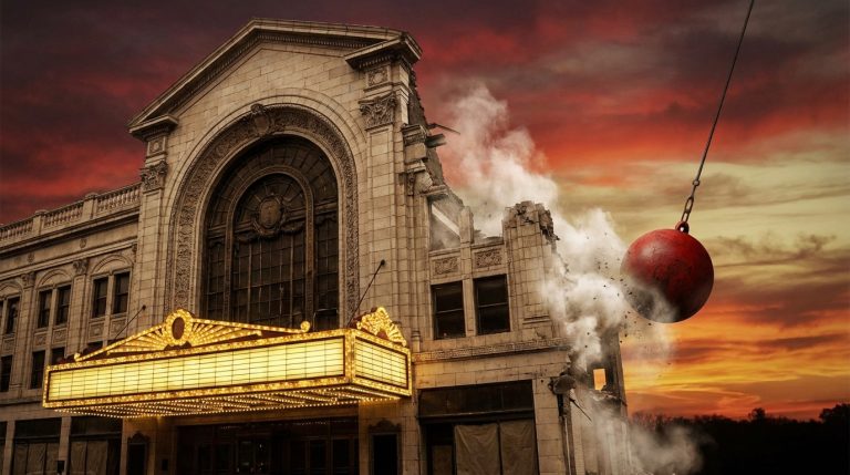
The paper smells faintly of dust and citrus, like a book that once lived above a bakery. The ink has softened from screaming crimson to a softened rust. Along the fold, a tiny crack catches the light, as fragile as a dried leaf. You are not just holding an image. You are holding an evening that happened in 1937, an opening night, a cigarette fog, a trumpet warming up backstage. Vintage posters do that. They do not just hang. They linger.
Collecting and preserving vintage poster art is about more than finding something “cool” for the wall. It is the quiet craft of rescuing fragments of public history from bad framing, sunlight, and time. The short version: learn to recognize original print methods and condition issues, buy from sources that show backs, edges, and close-up photos, store posters flat in archival materials, and keep them away from light, heat, and moisture. When it is time to frame, use conservation materials and UV-filtering glazing. Treat restoration as careful repair, not cosmetic surgery. If you do that, your posters will age like good leather, not yellowed tape.
What Makes Vintage Posters So Compelling?
Vintage posters sit in a strange space between fine art and street noise. They were meant to be temporary. Torn down. Pasted over. Ignored. That tension gives them power.
They were printed fast. Cheaply. For strangers.
And yet, the best ones feel like stage sets on paper. Scale. Gesture. Light. They had to read from across a boulevard or a subway platform. A bright field of color is not just design; it is a survival tactic in a cluttered city.
Vintage poster art is public memory pressed into paper: theater, travel, protest, product, and spectacle, all competing for a few seconds of your gaze.
For anyone working in set design or immersive environments, posters are priceless references. A single travel poster can tell you more about the mood of a decade than a history textbook. Not just what people did, but what they were promised.
Understanding What You Are Collecting
Before you start guarding edges and measuring humidity, you need to know what kind of object you are dealing with. Not every “vintage style” print has a fragile history. Many are modern reprints with durable inks and papers. Others are rare originals whose value can evaporate with one piece of tape.
Here is a simple way to think about it:
| Type | What it is | Why it matters |
|---|---|---|
| Original vintage poster | Printed in the same era as the event/product it promotes | Historically and financially valuable, fragile, deserves conservation care |
| Later reproduction | Printed decades after the original, often offset or digital | Good for decor and reference, lower value, more forgiving |
| Modern “vintage style” poster | New artwork created to mimic old aesthetics | Creative piece, but not a historical artifact |
The way you collect and preserve should change based on which of these you hold in your hands.
How To Recognize An Original Vintage Poster
Before you spend serious money, you need to learn to read posters the way a costume designer reads a seam. Up close. From the back. In raking light.
If a seller only shows you a straight-on photo of the front, treat that as a red flag, not a mystery.
Here are key clues to look at:
- Printing method
Lithography, especially stone lithography, is the heartbeat of many vintage posters. Under magnification, you will see overlapping fields of color that feel almost painterly. No tiny regular dots. Colors blend slightly at the edges. It feels alive.
Offset printing, common later in the 20th century, shows halftone dots. Repeatable. Regular. If you are looking at a “1920s” poster with very clean CMYK-style dots, pause. It may be a later offset reproduction of earlier art.
Screen printing has opaque, almost flat slabs of color with slightly raised ink. Many mid-century and later posters for theater, concerts, and political movements use this method.
- Paper
Originals often sit on thinner, more fragile stock. Newsprint-like for some mass posters. Heavier but still slightly brittle for others. You may see a faint watermark when held to light. Reproductions tend to use thicker, modern, smoother papers with a consistent machine finish.
- Margins and printer information
Look for:
– Printer imprints at the bottom: names of the print shop, city.
– Tiny text indicating “affiche” or “imp.” (for French printers), or similar notes in other languages.
– Sometimes a date or series number.
Reproductions may crop these off, re-set the text in a modern typeface, or add modern copyright text.
- Age markers
True age shows up as:
– Tanning along exposed edges.
– Light foxing (brown specks) in older papers.
– Fold lines that match shipping practices of the time (many theater and film posters were folded for mailing).
If a “1920s” poster looks as fresh as a brand-new art print, either it has lived a very protected life, or it is not as old as claimed.
Never be afraid to ask for photos of the back, corners, and extreme close-ups before buying.
Where Vintage Posters Come From
Knowing origin stories helps you read condition and rarity.
– Public posters: travel, public transport, government campaigns. Pasted in streets and stations, often printed in larger runs, but survival rates are low.
– Commercial posters: products, cafes, fashion. Many of the bold Art Deco styles sit here.
– Cultural posters: theater, opera, cinema, concerts. These overlap strongly with set design history.
– Political posters: protests, campaigns, movements. Often rougher papers, urgent prints.
Each group has different typical sizes, folding habits, and common damage. A mid-century cinema poster with center folds is not “ruined”; that is how it traveled.
How To Start A Vintage Poster Collection With Intention
It is very easy to buy random posters that look good on screen. It is harder, and more satisfying, to build a collection that feels cohesive. Almost like curating wall-sized stage props from another time.
Ask yourself some direct questions:
What Story Do You Want Your Posters To Tell?
Think in themes, not just images.
– Maybe you care about travel, and your focus becomes European railway posters between 1900 and 1950.
– Maybe you work in immersive theater and want original posters from magic shows, circuses, and cabarets.
– Maybe you are obsessed with typography, so you chase bold letterpress and early modernist layouts.
A collection with a thesis, even a loose one, ages better than a random pile of pretty objects.
When you view posters as narrative fragments, you start to see how color trends, fashion, public fears, and public fantasies shift over time. What did people want? Where were they urged to go? What were they told to buy to feel modern, or safe, or glamorous?
Condition Versus Character
In fine art, there is a strong obsession with flawless condition. With posters, that approach can flatten their history.
You will often face a trade-off:
– A very rare poster with some edge losses and fold wear.
– A less rare or later print in near-perfect shape.
If you want long-term market value, good condition matters. But if you care about atmosphere and authenticity for set and environment design, that crease might speak more loudly than a pristine reprint.
That said, some damage is not romantic, just destructive:
Tape, mold, heavy staining, and heavy trimming are not patina. They are structural problems.
Try to train your eye to tell the difference between:
– Honest wear from public use.
– Later abuse from bad framing, damp basements, or careless repairs.
Budget And Scale
Vintage posters often come large. That is part of the joy. It is also part of the storage challenge.
Before purchasing:
– Measure your available walls and flat storage.
– Decide a maximum size you can handle (for example: up to 100 x 140 cm).
– Set a realistic budget tier: modest, mid, or serious.
Think of your budget not only in purchase price, but in long-term care. A very fragile, expensive poster with no money left for proper framing is a risk. Sometimes a slightly less rare poster that you can frame well is the better choice.
Good Sources And Bad Shortcuts
Gallery dealers, auction houses, estate sales, and specialized online shops form the core of the serious market. Flea markets and thrift stores still occasionally yield treasures, but these are exceptions now.
Be careful with mass-market “vintage” sites. Many sell digitally printed reproductions with no clear labeling. That is not evil, but it is misleading when you are trying to collect historically.
Ask direct questions: Is this original? What year was it printed? What printing method? Has it been linen backed or restored?
If a seller avoids answering or gives vague replies, your money is better spent elsewhere.
The Enemies Of Vintage Posters
Preserving posters is not glamorous. It is a quiet war against very ordinary things: light, humidity, temperature, insects, poor materials, and harsh handling. Think of yourself as a stage manager for fragile paper.
Light: The Slow Thief
Light is the most persistent danger.
– Direct sunlight can bleach inks and embrittle paper in a matter of months.
– Strong artificial light, especially non-filtered LEDs or halogens, can also cause fading over time.
Ultraviolet radiation does the most damage, but visible light also contributes. High-chroma colors (reds, oranges, some blues) go first. Black text sometimes holds longer, giving posters a weird, ghostly look: image faded, typography lingering.
To protect:
If you can comfortably read a book there for hours, it is probably too bright for an unprotected vintage poster.
Use UV-filtering glazing when framing, and avoid direct window exposure. If you want a poster in a bright room, consider hanging a high-quality reproduction and storing the original safely.
Humidity And Temperature: The Invisible Set Designers
Paper responds to climate like an actor responds to notes. It shrinks, swells, warps, and cracks.
– High humidity (above roughly 60%) encourages mold, foxing, and cockling.
– Low humidity (below roughly 30%) can make paper brittle, increasing the risk of cracking along folds.
– Rapid shifts from cold to warm can cause expansion and contraction stresses.
Aim for a stable, moderate environment. Not a perfectly controlled museum vault, but steady. No basements that smell damp. No attics that bake in summer. No hanging above radiators or fireplaces.
Physical Stress And Poor Materials
Folding, rolling too tightly, clipping with harsh metal, and using cheap tapes and glues can all shorten a poster’s life.
Common killers:
– Pressure-sensitive tapes (old clear tape, duct tape, many “invisible” tapes).
– Ordinary cardboard backing, which is acidic and leaches into the paper.
– Non-archival mats and adhesives.
Once acidity migrates into the paper, it can cause tanning, brittleness, and staining that even a conservator can only partly reverse.
Safe Storage For Vintage Posters
Think of storage as pre-framing care. Even if a poster is waiting for its time on your wall, it deserves a proper resting place.
Flat Versus Rolled
Flat storage is best for most posters, especially those with folds or fragile paper. Rolled storage may be acceptable for strong, modern paper or for short-term transport, but it is less forgiving over decades.
If a poster already has sharp folds, keeping it flat reduces stress along those existing fault lines.
For flat storage:
– Use archival, acid-free folders or large sleeves.
– Place posters between sheets of acid-free paper or glassine.
– Store in a flat file cabinet or a sturdy portfolio that lies horizontal.
For rolled storage (when flat is not possible):
– Roll around a wide, archival tube, image side facing out.
– Interleave with acid-free tissue.
– Do not strap tightly; a gentle roll is kinder.
Archival Materials To Rely On
Look for words like “acid-free,” “lignin-free,” and “conservation grade” when buying folders, tissue, and backing boards. Museum or conservation suppliers are safer sources than general craft stores.
Avoid:
– Self-adhesive plastics marketed for posters.
– Regular cardboard or chipboard.
– PVC sleeves, which can off-gas over time.
Choose:
– Polyester, polyethylene, or polypropylene sleeves made for archival use.
– Buffered storage materials for most posters, unless they have special media that reacts poorly to buffering (in that case, a conservator’s advice is helpful).
Framing Vintage Posters Without Harming Them
Framing is where collecting meets display. It is also where many posters suffer.
A frame can be armor or a trap; the difference lies in the few materials you do not see.
The Core Principles Of Conservation Framing
1. The poster must be supported but not strangled.
2. All materials touching the poster must be archival and reversible.
3. Light exposure must be filtered and minimized.
Let us break that down.
Support And Mounting
Never glue an original vintage poster directly to a backing board. Do not use spray adhesives.
Safer methods:
– Hinges made from Japanese paper and wheat starch paste, attached to the top edge only. This keeps the poster secure but allows natural movement.
– For very fragile pieces, mounting by a professional conservator on a reversible support (like Japanese paper lining) can help.
The backing board itself should be:
– Rigid enough to prevent warping.
– Acid-free and conservation grade.
Glazing: Glass Or Acrylic
Both can work.
Glass:
– Heavier, more fragile.
– Available with good UV protection.
– Can cause more damage if the frame falls.
Acrylic:
– Lighter, less likely to shatter.
– Can scratch more easily.
– Also available with UV-filtering options.
The key is to keep the poster from touching the glazing. A mat or spacer creates a small air gap. Contact with glass or acrylic can cause sticking, abrasion, and condensation problems.
Mats, Borders, And Visual Space
A mat is more than decoration. It is breathing room.
– Use archival mat board, not cheap “papery” mats that will go yellow.
– Give the poster some space; do not crowd the edges.
– If a poster has rough or uneven edges, consider a mat that covers only a few millimeters beyond the outer damage, so the image remains generous.
For immersive environments, sometimes you will want no mat, for a more raw, poster-on-wall feel. In that case, use spacers hidden inside the frame to keep the glazing off the surface.
Linen Backing: Repair Or Compromise?
Linen backing is common in the poster world. The poster is mounted onto a layer of paper, which is then mounted onto linen. This flattens folds, reinforces weak paper, and makes framing easier.
It is both a blessing and a disagreement point among purists.
Pros:
– Stabilizes fragile or heavily folded posters.
– Can greatly improve visual presentation.
– Often considered acceptable and even standard for many early 20th century posters.
Cons:
– It is an intervention, not neutral storage.
– Poorly done backing can introduce new problems.
– Some collectors prefer untouched, never-backed examples and may pay more for them.
If linen backing is on the table, treat it as a conservation procedure, not a cosmetic upgrade at a shopping mall.
Choose a restorer who explains their adhesives, papers, and cleaning methods. Ask what is reversible and what is not. Be cautious about heavy overpainting or “improvements” that change the original art.
Cleaning And Restoration: How Far Is Too Far?
There is a thin line between rescuing a poster and rewriting it.
Simple, low-risk steps you can handle:
– Very gentle surface dusting with a soft, dry brush, if the media is stable and not flaking.
– Removing loose dirt around, but not on, the poster.
Anything involving water, solvents, bleaching, or serious tear repair belongs to a trained conservator.
Common Restoration Procedures
– Deacidification: neutralizing acids in the paper to slow decay.
– Washing: controlled baths to remove stains and old adhesives.
– Mending: repairing tears with Japanese tissue and reversible adhesives.
– Inpainting: retouching areas of color loss to match surrounding tones.
Think carefully about your ethics here.
Every restoration choice is an editorial choice about history: what you allow to remain visible, and what you decide to erase.
A few small tears mended but still visible can keep a sense of age and use. Heavy inpainting that recreates missing sections may look perfect from a distance, but the poster becomes more “restored image” than surviving artifact.
If your primary interest is design reference for your own work, you might accept more aggressive restoration because legibility matters more than purity. If you care about historical collecting, lean toward gentler, clearly documented treatments.
Living With Vintage Posters In Real Spaces
You are not running a museum. You are trying to live with these objects. Surrounding yourself with large, loud sheets of history can inform your creative work, your sets, your installations.
So it is fair to ask: how careful is practical?
Rotating Displays
One way to balance enjoyment and protection:
– Keep a core group of framed posters on long-term display in relatively stable, indirect light.
– Rotate more fragile or important posters in for limited periods, then return them to dark, flat storage.
This approach echoes costume archives: not every garment is under stage light all year.
Using Reproductions Strategically
This is where you should not be precious.
For:
– Bars and restaurants.
– High-traffic corridors.
– Environments with smoke, cooking fumes, or strong light.
Use high-quality reproductions of your vintage posters. Let them take the daily abuse, while your originals live carefully nearby. You still own the image and the reference, but you are not sacrificing irreplaceable paper to an espresso machine.
Honoring an object can mean admitting that your wall is not safe for it.
Posters As Design Teachers
Treat your posters as teachers, not just decor.
Stand close and look at:
– How few colors they use.
– How type interacts with image.
– How negative space is wielded to shout across a street.
For set design and immersive projects, these lessons are direct. A poster that had to seduce a passerby in three seconds is not so different from a scenic reveal that must read instantly when house lights fall.
Let your collection shape how you think about:
– Scale: Many vintage posters use gigantic, simplified forms.
– Color: Limited palettes with strong contrasts.
– Story: One captured moment that implies a whole narrative.
Documenting Your Collection
Preservation is not only physical. It is also about information. Over time, details of origin, acquisition, and treatment can blur. Your future self, or whoever inherits your collection, will be grateful for clear records.
What To Record
For each poster, note:
– Title or subject (for example: “Paris Metro Travel Poster: Ligne Nord-Sud”).
– Artist/designer if known.
– Printer or publisher.
– Year or approximate decade.
– Printing method (lithograph, offset, screen print, letterpress).
– Dimensions.
– Condition at purchase.
– Purchase source and price.
– Any restoration work, with dates and by whom.
Store this info in both digital form and a printed binder kept separately from the posters. Include photographs: wide shot and details of corners, margins, and key features.
Your notes are part of the poster’s future provenance; they give the piece a traceable life beyond your walls.
Insurance And Value
If your collection grows beyond a few pieces, it becomes more than decoration. It becomes an asset, and it deserves the same practical thinking you would give to lighting rigs or scenic stock.
Assessing Value
Value rests on:
– Rarity of the design.
– Demand for the subject, artist, or style.
– Condition and originality (untrimmed margins, minimal restoration).
– Provenance for especially significant items.
Do not rely solely on retail gallery prices. Look at auction results for similar items. Values can move with trends in design collecting. Travel posters may surge for a time; cinema posters may cool, then surge again.
Insurance Basics
Consider:
– Adding your posters to a contents policy with scheduled items.
– Keeping updated photographs and purchase invoices.
– Storing your documentation separately in case of damage to the home or studio.
Insurance does not preserve the art, but it allows you to rebuild a collection if something catastrophic happens. That can feel cold, yet it is a rational part of caring for fragile, high-value paper.
When Vintage Posters Enter Immersive Or Theatrical Work
For someone designing sets, experiences, or site-specific pieces, vintage posters can be both reference and active material. This is where your artistic urge might collide with conservation ethics.
Using Originals In Live Environments
If you want to use authentic vintage posters as scenic elements:
– Prefer less rare, more common designs.
– Choose pieces already in compromised condition, where additional wear is less tragic.
– Protect backs with reversible, archival supports.
– Keep them away from direct handling by audiences.
You will need to accept that performance environments are rough. Light cues, temperature swings, and touring all impose stress.
In many situations, the honest answer is: use reproductions. Capture the authenticity of the design, not the physical object, and keep the original safe.
Reinterpreting Vintage Posters As Design Language
Vintage posters can act as an internal vocabulary for new work:
– Borrow proportion: large dominant figure, small block of information.
– Borrow gesture: curved diagonals, radiating lines, bold silhouettes.
– Borrow texture: the mottling of old stone lithography, the slight misregistration of colors.
By studying them closely, you can translate these qualities into scenic painting, projection design, or printed elements that feel historically grounded without being direct copies.
The goal is not nostalgia for its own sake; it is fluency. You learn the visual grammar of a period so your invented spaces speak it without strain.
How To Avoid Common Mistakes
Even careful collectors make missteps. Some are annoying, others are costly.
Mistakes To Watch For
- Buying on impulse from low-detail photos, only to find heavy restoration or reproduction printing.
- Framing with bargain frames that use acidic cardboard backs and non-UV glass.
- Hanging valuable posters in kitchens, bathrooms, or sun-flooded rooms.
- Storing rolled posters in tight, narrow tubes that create permanent curvature.
- Trying DIY wet cleaning after reading a quick tutorial, and causing ink to bleed.
All of these are avoidable with a bit of patience and skepticism. When in doubt, slow down. Ask another collector for a second opinion. Reach out to a conservator. It is better to postpone framing for a few months than to rush into a decision that cannot be reversed.
Letting Posters Age With You
Vintage posters are not fragile ghosts that must never see air. They are robust enough to have survived streets, staples, and rain. They can live with you if you respect their limits.
Over years, your relationship with them will change. A piece you bought for the color might become precious because of who you were when you found it. The small tear at the corner that once annoyed you might start to feel like a signature.
Preservation is not about freezing objects in time; it is about giving them the conditions to keep telling their story for longer than you will be able to listen.
Collecting vintage poster art is, at its core, a design choice about your own environment. You choose to share your daily space with old promises, old nights out, old trains, old stages. You choose to treat paper as something worth planning around.
If you hold that thin sheet gently, store it thoughtfully, frame it with care, it will keep doing its work: pulling people in from across the room, the way it once pulled strangers in from across a city street.