The wall stares back at you. Flat. Lifeless. A sheet of dull color catching the work lights in a way that makes everything feel unfinished, like a rehearsal that never ended. You can almost hear it asking: “Is this all I am? Beige?”
You pick up a brush, a sea sponge, a rag. Suddenly that blank surface is not a wall anymore. It is stone. It is weathered plaster in an old theater. It is steel that has seen rain and fire. It is wood that remembers hands and years. Faux finishes are not about faking reality. They are about giving your sets history in a few layers of paint.
The short version: faux finishes let you cheat time. With glazes, broken color, texture tricks, and a few smart tools, you can turn cheap flats into carved stone, crumbling stucco, polished marble, tarnished metal, or aged timber, fast and at scale. The key is not secret products. It is observation, layering, and restraint. You study real materials. You exaggerate what reads from a distance. You simplify what does not. You work wet into wet for softness, dry brush for age, and glaze for depth. The wall becomes a story, not a backdrop.
Faux finishes are less about imitating materials perfectly and more about capturing their character in a way that reads instantly from ten, twenty, fifty feet away.
What Faux Finishes Actually Do Onstage
Before technique, it helps to define what these surfaces are doing for you as a designer.
A painted faux finish on a set wall does three main things at once:
| Function | What it does onstage | What it means for painting |
|---|---|---|
| Depth | Makes flat scenery feel like it has layers, thickness, distance. | Use glazes, broken color, shadows, and highlights. |
| Age | Suggests history: worn edges, stains, patches, repairs. | Add irregularity, grime layers, and subtle damage. |
| Material | Tells the audience if something is stone, wood, fabric, metal. | Match the way light behaves on that material. |
A perfectly smooth, single-color wall is honest but emotionally empty. It has no story. No memory. Faux finishing is the craft of giving memory to plywood.
Every material has a signature: how it breaks, stains, chips, and reflects light. If you paint that signature clearly, the audience believes it.
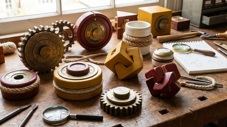
The Core Tools and Materials That Actually Matter
You do not need a magic kit. You need a small, deliberate set of tools that you know well. After that, it is about practice and observation.
- Base paints: Matte or eggshell latex/acrylic in your main colors.
- Glaze: Clear acrylic glaze or a mix of paint with clear medium and water.
- Brushes: Large scenic brushes, sash brushes, cheap chip brushes for texture.
- Rollers: For fast coverage and soft, mottled effects.
- Sponges: Natural sea sponges for irregular patterns, synthetic for uniform dabbing.
- Rags: Cotton rags for wiping, veiling, and dragging.
- Scumbling tools: Big brushes, rollers, or even hands in gloves.
- Detail tools: Lining brushes, small rounds, and a few stiff brushes for dry brushing.
The material choice matters far less than your control of moisture: how wet the surface is, how fast it dries, and how you layer one color into another.
If your theater is working on a tight budget, you can thin ordinary wall paint with a bit of water and clear medium and treat that as glaze. Purity of product is not the priority. Control is.
Core Technique: Scumbling and Glazing
Most faux finishes sit on a foundation of just two moves: scumbling and glazing. Once those make sense in your body, everything else starts to feel like variations.
Scumbling: Breaking Up the Flatness
Scumbling is the painter’s version of atmospheric perspective. You take two or more wet colors and work them together on the surface, letting them mix in irregular, soft patches. The aim is not a smooth gradient. You want a cloud of broken color.
It works like this:
1. Lay in a base coat. Let it dry.
2. Mix two or three related colors: a mid-tone, a lighter tone, and maybe a slightly darker one.
3. While the wall is still slightly damp from a fresh glaze or from lightly misting with water, load different areas of your large brush or roller with different colors.
4. Apply in overlapping X or circular motions, keeping the edges soft.
5. Step back. If you see obvious “handwriting” or repeating shapes, break them up with a clean, slightly damp brush.
This is the breath under many finishes: old plaster, mottled stone, faded painted wood. It turns a single color into a surface that suggests depth and variation.
Glazing: Depth Through Transparency
A glaze is a thin, translucent paint layer that allows underlying color to show through. You can push a wall forward or backward in space just by adjusting how rich or subtle your glaze is.
For scenic work, a simple glaze mix might be:
– 1 part paint
– 3 to 5 parts clear glaze or acrylic medium
– A bit of water to adjust flow
You can make glazes for:
– Aging: warm brown, gray, or greenish tones to stain corners and edges.
– Enriching color: a transparent layer of deeper color over a flat base.
– Shifting temperature: cool glazes for shadowy areas, warm for sunlit spaces.
The key is control over transparency. You want to build slowly. It is easier to deepen later than to fix a wall that suddenly turned into a dark cave.
Glaze is where patience pays off. Thin, repeated veils of color will always look richer than one heavy, blunt layer.
Faux Plaster and Old Walls
A good plaster finish is a quiet star. It rarely draws attention to itself, but it makes the world of the play believable. It suggests buildings that have been repainted, patched, repaired, loved, abandoned.
Reading Real Plaster Before Painting
When you look at real old plaster, notice:
– Color: It is rarely pure white or pure beige. There are subtle shifts, warm and cool patches, soot near ceilings, damp stains near floors.
– Texture: Hairline cracks, trowel marks, smoother repairs over rougher areas.
– Edges: Corners are slightly darker and dirtier. Around door frames and switches, you see marks of hands and furniture.
Then you translate that into a version that reads from the audience.
Technique: Soft, Lived-In Plaster
1. **Base coat**
Paint the wall a mid-tone plaster color: warm light gray, sandy beige, or a very pale ochre. Matte finish is best.
2. **Scumbled layers**
While working in sections, scumble slightly lighter and slightly darker tones over the base. Think of wide clouds, not spots. Keep the transitions gentle.
3. **Veiling glaze**
Apply a very thin glaze of a unifying color (often a slightly warmer tone) over the scumbled area. This softens harsh spots and makes it feel like one surface.
4. **Aging corners and edges**
With a dilute darker glaze (gray-brown or gray-green), wash in corners, under any ceiling line, and around door frames. Immediately soften with a clean damp brush or rag, moving downward to mimic gravity.
5. **Cracks and repairs (sparingly)**
Use a very fine brush with a weak gray line for cracks. Then soften one side of each crack with a fingertip or damp brush, giving it a slight shadow. Add a few lighter or darker rectangular patches to suggest repairs.
Realistic plaster is about restraint. One single crack placed with care is more convincing than a wall covered with decorative fractures.
Stone: Weight Without Weight
Stone on stage is a trick of light, edges, and confidence. The audience has to feel the weight without ever touching it.
You can think of scenic stone in two categories:
– Cut stone: blocks, bricks, carved details.
– Rough stone: rock walls, caves, natural faces.
Block Stone Walls
Start with the illusion of mortar and volume.
1. **Base color**
Paint the entire wall the color you want for the mortar lines. Usually a light gray or warm stone gray.
2. **Block layout**
Snap chalk lines or draw with pencil. Vary sizes slightly. Perfect uniformity feels artificial.
3. **Block color**
Scumble blocks individually or in small groups. Use 2 to 3 related stone colors: a cool gray, a warmer beige-gray, maybe a greenish or brownish tone. Vary from block to block while still keeping the wall cohesive.
4. **Soft aging glaze**
Apply a tinted glaze vertically, letting more settle in the “mortar” lines. Soften with a wide brush, keeping your stroke direction consistent with imagined rain.
5. **Highlight and shadow trick**
This is where stone starts to pop. Choose an imaginary light direction. On the top and light-facing side of each block, drag a lighter color; on the lower and opposite side, drag a darker shadow tone. Work quickly and keep edges slightly broken so they do not become cartoon outlines.
6. **Texture touches**
Use a sponge or stiff brush to dab speckles, chips, and mineral spots. Keep your hand light.
Rough Stone and Rock Faces
For natural stone, the pattern is less regular. You are painting geology, not masonry.
– Use bolder scumbling with broken, diagonal strokes.
– Introduce more color variety: cooler grays, iron-rich browns, mossy greens.
– Use dry brushing across imagined protrusions to catch “high points” with a lighter color.
– Deepen cracks and crevices with thin, dark glazes, then soften the edges so they feel recessed.
For stone, the direction of your light defines everything. Every stroke should agree on where the light comes from.
Wood: Grain, Warmth, and Wear
Wood is about rhythm. The grain lines, the knots, the way boards repeat and shift. On stage, it tells the audience if a space is refined, rustic, or improvised.
Choosing Your Level of Detail
From a balcony, nobody sees every grain line. From the front row, too simple a pattern looks cheap. Decide how close the audience will be and pick your density accordingly.
– Far view: big boards, bold grain, strong contrast.
– Medium view: moderate grain detail, more variation in tone.
– Close view: finer grain, knots, edge wear, stains, perhaps even nail marks.
Basic Wood Graining Technique
1. **Base color**
Lay in a mid-tone that matches the overall wood value you want. For pine, a warm yellow-brown. For darker woods, a richer brown.
2. **Board layout**
Use tape or a straightedge to define boards. Vary widths. Align joints with scenic lines if possible.
3. **Glaze for grain**
Mix a darker glaze. Brush it along the length of boards. Before it dries, manipulate it:
– Use a soft, dry brush to feather strokes with long, straight pulls.
– Rock a rubber graining tool or a folded rag to create curves and knots.
– Break straight lines occasionally. Nature does not repeat like wallpaper.
4. **Knots and variation**
Where you want knots, create circular or oval motions within the wet glaze, then drag through them to blend. Keep knots sparse; too many look decorative rather than structural.
5. **Highlights and wear**
Dry brush a lighter tone along the centers of boards to suggest wear from feet or hands. On edges, add tiny chips of a lighter, grayer tone for old, worn wood.
6. **Aging wash**
If the result feels too bright or theatrical, unify with a very thin gray or brown glaze, wiping more away from the center of boards and leaving more in seams.
Convincing wood has quiet chaos: small irregularities that prevent any sense of a repeating pattern.
Metal: From Polished Steel to Rusted Iron
Metal surfaces tell strong emotional stories. Polished steel feels clinical. Rusted iron feels vulnerable and forgotten. You control this mood with sheen, color temperature, and patterns of damage.
Polished or Painted Metal
If you want painted metal (doors, beams, industrial rails):
1. **Base coat**
Solid, slightly cool tone: blue-gray, green-gray, or industrial beige.
2. **Sheen**
If possible, finish with a satin or semi-gloss clear coat to reflect stage light in a tighter, harder way than matte walls.
3. **Subtle panel variation**
Very thin vertical glazes of cooler and warmer tones within panels give slight shifts, suggesting different coats of paint.
4. **Edges and chips**
Use a sponge or stiff brush to add chipped areas: first a dark underlayer for “primer,” then tiny bright metal chips where fresh scrapes would be.
Rust and Weathering
Rust works best layered, not sprayed on in one loud color.
1. **Shadow base**
Start with a dark, almost black-brown base near areas of rust concentration: bolts, seams, lower edges.
2. **Rust colors**
Prepare several colors: deep burnt sienna, red-brown, orange-brown, and a dull yellow-brown.
3. **Application**
Tap in darker rust near sources (bolts, joints), then bleed it outward and downward with successively lighter tones. Work wet into wet so they blend softly.
4. **Drips and stains**
Pull vertical drips with a damp brush. Avoid making each drip the same length. Some stop, some break, some spread.
5. **Oxidation haze**
Lightly glaze surrounding areas with a dull, transparent yellow-brown to suggest staining beyond the main rust.
Metal is also sensitive to direction of light. Adding subtle horizontal highlights in a lighter cool gray can suggest brushed steel or aluminum, especially if you keep them parallel and consistent.
Marble and High-Status Surfaces
Marble can easily become kitsch if handled without care. The temptation is to overdo the veins. In reality, the marble reads through gentle shifts and sparing, purposeful veining.
Marble: Depth First, Veins Second
1. **Base color**
Choose a mid-tone matching the marble type: pale cool gray, warm ivory, greenish, or dark rich stone.
2. **Clouded layers**
Scumble in two or three closely related tones, keeping everything soft and airy. Blur transitions with a soft, clean brush.
3. **Veining glaze**
Mix a thin glaze for veins in a cool or warm gray. With a fine brush, let your hand wander in gentle arcs, branching and rejoining. Avoid repeating S shapes and parallel lines.
4. **Softening veins**
Immediately soften parts of the veins with a clean, damp brush, breaking them in and out of visibility. In real stone, veins fade and reemerge.
5. **Secondary tones**
Add a few areas where veins cluster and become almost fields of color, not single lines. This creates focal interest.
6. **Final glaze**
Veil the whole surface with a nearly clear glaze of a unifying color to bury the veins slightly, helping them feel inside the stone rather than on top.
For high-gloss marble, a clear coat with more sheen will make the surface catch light in a refined way.
Good marble painting feels like you trapped moving clouds inside stone and let a few of their paths show through.
Atmospheric Aging: Grime, Smoke, and Patina
Most realistic sets share one secret: they are a little dirtier than you think. Not filthy, just lived in. This aging is usually the last step, the quiet layer that pulls all the separate elements into one world.
Where Dirt Actually Lives
Do not just smear brown glaze everywhere. Ask:
– Where would hands frequently touch? Door frames, railings, around switches, the edges of furniture.
– Where does water flow or sit? Lower walls, corners, basements, window sills.
– Where does smoke or heat rise? Above lamps, stoves, fireplaces, high corners.
Focus your grime there.
Aging Techniques That Do Not Ruin Your Work
– **Washes**: Very thin glaze brushed on and then mostly wiped away, leaving only a hint in recesses.
– **Spattering**: Use an old brush to flick tiny droplets, suggesting specks, mold, or accumulated dust.
– **Rubbing and burnishing**: With a damp rag, gently rub areas where skin contact would polish or darken surfaces.
Patina for metals, such as verdigris on copper, should be treated like an accent. A few calm areas of greenish-blue near seams and recessed shapes will speak louder than an entire wall soaked in color.
Thinking for the Stage: Scale, Distance, and Light
A faux finish that looks magnificent up close can disappear under stage light or from the balcony. The physics of viewing distance must shape your decisions.
Scale and Contrast
When you paint for a stage:
– Make patterns larger than in real life. Stone blocks a bit bigger, wood grain bolder, cracks slightly more visible.
– Increase contrast slightly so that textures do not flatten under lighting.
But you need balance. Excessive contrast can steal focus from actors. Test sections under work lights and, if possible, show me scenes under stage light early.
Color and Temperature Under Stage Light
Stage light will shift your colors. Warm amber will make subtle warm walls feel almost orange. Cool light can kill gentle blue-gray nuance.
To adjust:
– Keep main surfaces slightly neutral in hue, then add warmth or coolness with glaze where desired.
– Sample your main palette under something close to your plot’s key lights before committing to the whole set.
If the director keeps looking at your wall more than the actors, the finish is too loud. Scenic painting supports the story; it does not audition for a role.
Speed vs Detail: Painting for a Production Schedule
On real productions, time is tight. You may not be able to give every square meter the care you dream of. This is where strategic decision making matters.
Prioritize Focus Areas
Ask yourself and your team:
– Which walls are closest to the audience?
– Where do key scenes take place, with actors near the walls?
– Which surfaces will be heavily lit or filmed close?
Spend your detailed work there. For backgrounds, you can use broader scumbling and simplified texture that still reads.
Simple Tricks That Save Time
– Use rollers for large scumble areas instead of only brushes.
– Pre-mix glaze colors for the whole day so you are not constantly adjusting.
– Work in teams: one person lays in base and glazes, another adds detail behind them.
If your plan involves highly detailed marble on every surface, I would challenge that. Overambition kills schedules. Better to have a few beautifully finished focal points than a half-finished, inconsistent world.
Testing, Corrections, and Knowing When to Stop
Paint is forgiving. Glaze is more forgiving. Your greatest risk is not failure; it is overworking.
The Test Panel Habit
Before committing to a whole wall:
– Take a piece of scrap scenery.
– Run through your planned steps quickly.
– Put it where the set will live and look at it under strong light.
This small ritual can save hours of repainting.
Fixing Common Problems
– Surface too busy: Screen it back with a thin unifying glaze, slightly closer to the base color.
– Surface too flat: Add one more subtle layer of variation, some directional aging, or slightly stronger contrast at edges and corners.
– Colors feel wrong: Change the temperature with a transparent warm or cool glaze rather than repainting.
Know your stop point. When you catch yourself adding details only you can see at arm’s length, step back to the house and decide from there.
Training Your Eye: The Real Source of Good Faux Finishing
The best scenic painters are not just quick with brushes. They are obsessive observers.
You can train this muscle:
Looking at the Real World Differently
On a street or in a building, pick a surface and ask:
– Where are the darkest areas, and why?
– How does the color change as it moves up, down, around corners?
– Are the edges crisp or soft?
– What is the main pattern, and what are the exceptions?
Imagine how you would paint that in three or four stages. This mental rehearsal builds confidence before you ever touch the set.
Keeping Reference Material
Do not rely on memory.
– Take photos of walls, doors, floors, metals, and stones that interest you.
– Print or collect them in a simple physical or digital library.
– Bring them to the paint shop. Decide which elements you will keep, which you will simplify, and which you will ignore.
One specific warning: do not copy photo textures literally onto walls. Scenic painting is interpretation. You translate, exaggerate, and simplify for the stage.
Faux Finishes as Storytelling, Not Decoration
In the end, the question is not “How realistic can I make this faux marble?” but “What does this wall tell the audience about the world of this story?”
An oppressive stone prison might have heavy, dark blocks with stark, cold highlights and hard edges. A comfortable kitchen might show soft, worn plaster with warm stains near where people lean and touch. A futuristic corridor might favor flat, sleek surfaces with subtle panel lines and carefully controlled reflections.
The technique is at the service of the story. The best compliment for a faux finish in theater is not “That looks exactly like real stone.” It is when the audience never questions it and simply feels the weight, age, or cleanliness of the setting.
Good scenic paint vanishes into the fiction. The audience believes the world and forgets that it was canvas and plywood this morning.
When you stand in front of a blank set wall, brush in hand, you are not just coloring shapes. You are giving the actors a place that holds their characters, and giving the audience a surface their imagination can grip. With a few careful layers, a bit of glazing, and an eye for how materials behave, those flat planes stop being scenery and start being lived space.